EASYCASE
UX design
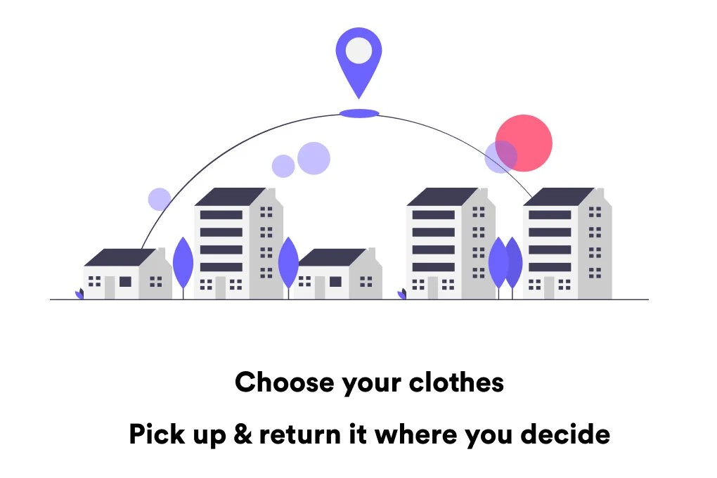
EasyCase is a website that allows the traveller to reduce or eliminate luggage by online renting second-hand clothes. The garments can be picked up and returned at the hotel or airport in the destination city.

Overview
We live in a society that moves and moves more every day. One of the most commercialized types of transport is the plane, and although we can travel in one day from one part of the world to the other in 24 hours, the transport of clothing is not the strongest point of the experience.
Most airlines have many baggage weight and size restrictions. Users have to queue to check them in, their suitcases may be lost and, furthermore, the cost of these suitcases is not usually considered when selecting the ticket.
The goal is to create a service that provides an alternative to luggage in the destination city.
The context it is a booming circular economy whose users and companies want to give their products a second life.
My rol is to design and test the UX.

Steps
Understanding the problem.
Excessive suitcase weight and size when traveling. Discomfort of the user when transporting it and also due to the risk of losing or possible scratches or bumps in it.
¿How can we solve it?
Reduce or eliminate luggage by online renting second-hand clothes for your trip. Pick up and return at the hotel or airport in the destination city.

¿How organize the content?
Definition of the sitemap and content of the service taking in account the conditions defined in the research.
Wireframes and feedback.
Product prototype with continuous user testing iterations.
Understanding the problem
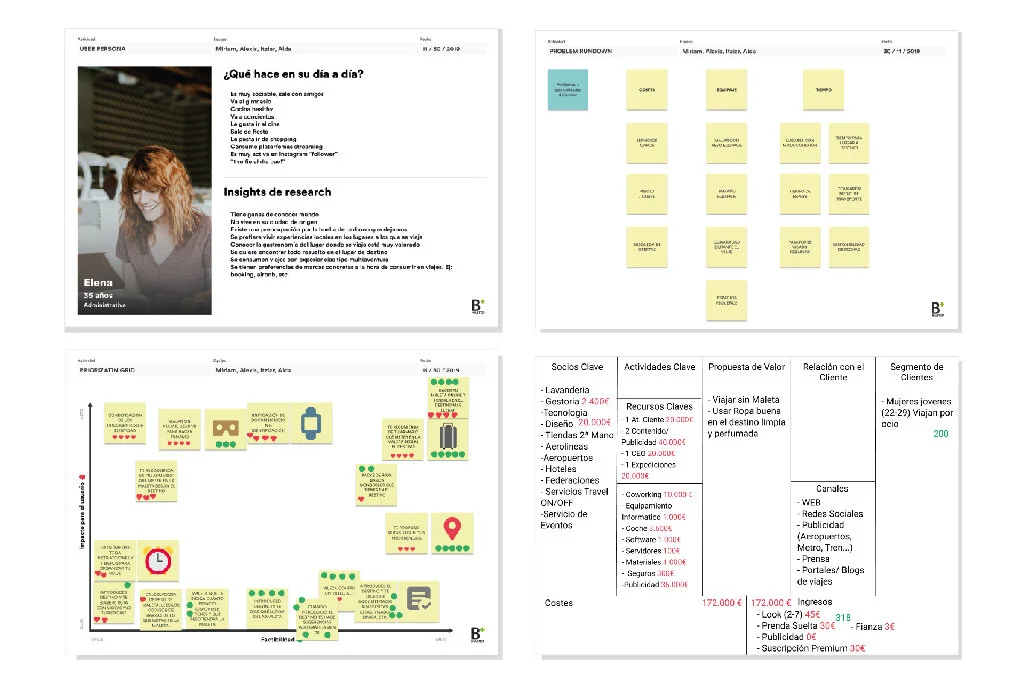
In order to provide a new service to cover a need in the "travel and transports" sector, we began with the objective of finding real problems to deal with. To obtain data quickly and truthfully, we interviewed some possible users, from where we extracted enough information to later carry out different empathy exercises (stakeholder map, empathy map...) to understand better the insights.
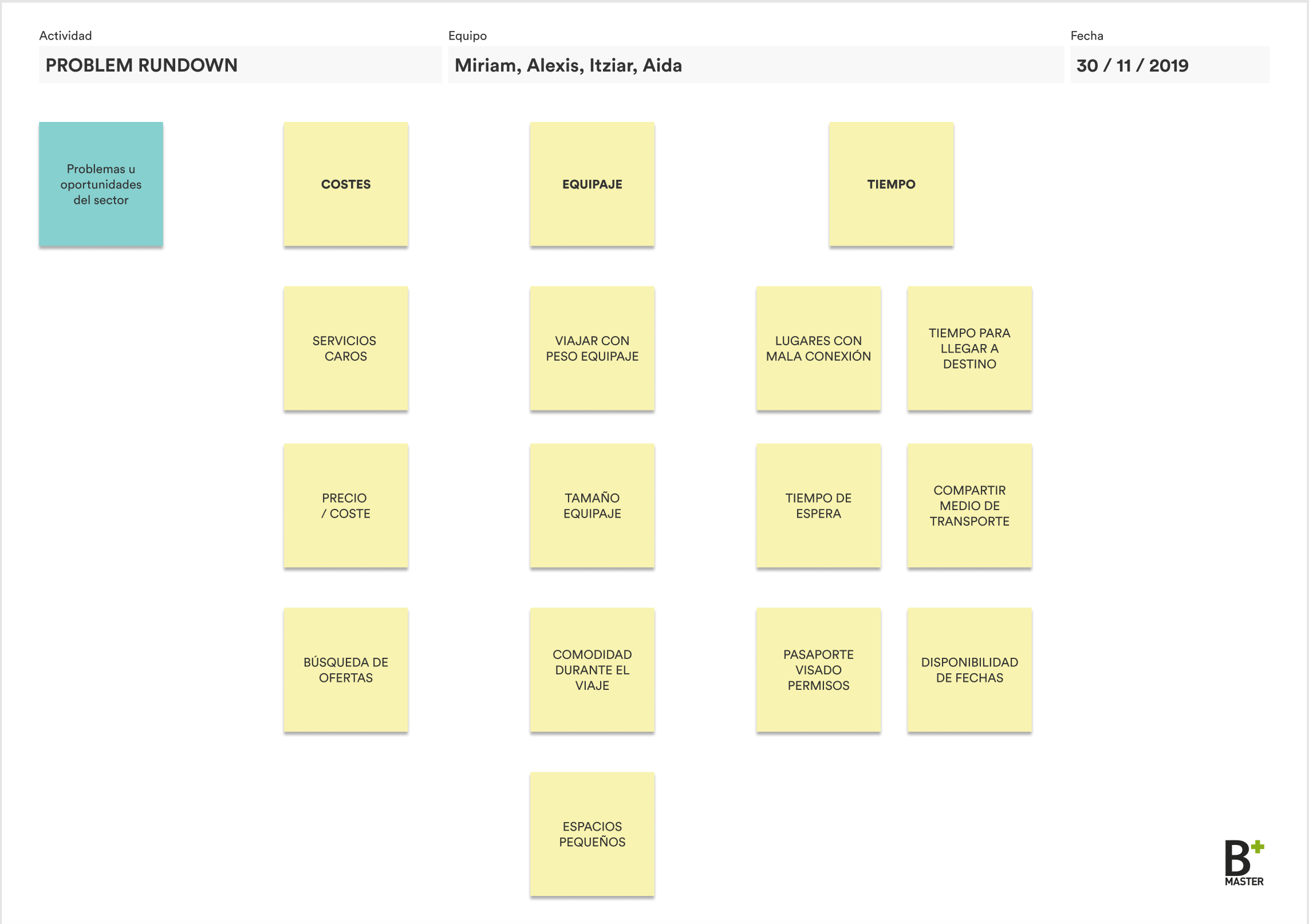
Problem rundown
After getting the first results from the user interviews, we could highlight the main problems we found: time to reach the destination, luggage size, trips with many flight connections, waiting times...
Prioritization grid
We then analyzed the problems and rated them in a prioritization grid, according to their feasibility and the user impact, which then led us to decide on which problem to focus: transporting luggage.
Lean canvas
For a first MVP approach we defined and focused on our early adopters, young women who travel for leisure frequently, for who we proposed the following solution: travel without a suitcase every time you take a plane by renting good second-hand clothes at destination. Thus aspiring to be the Airbnb of fashion.
The channels through which the service would be disclosed are: the website itself, influencers, the press, travel agencies, travel blogs and adverts in airports, on the subway and on the train.

Understanding and defining
Problem rundown

Prioritization grid

Lean canvas
¿How can we solve it?
After analyzing all the information we obtained during the research phase, we laid down the main ideas and began to shape the service. To do this, we established the most common platform user values that would then be used to design the experience. In addition, we established the content that had to be part of the platform after doing a previous investigation of the services offered by similar companies.
It should be noted that the entire platform is designed in English because it is focused on foreign users who come to visit to Valencia.
The problem is the excessive weight and size. Discomfort when transporting it.
The solution proposed is: Reduce or eliminate luggage by online renting second-hand clothes for your trip. Pick up and return at the hotel or airport in the destination city.
The two main service values are:
Social awareness: The service must be responsible with the city in which it is offered, both with people and with the environment.
Offering the most relaxing experience: people who choose this service want to have the most relaxing experience by not thinking about the luggage at all and avoiding the frictions that current services are giving them. The user want and must enjoy the trip.
¿How organice the content?
After doing a list of the content, the sitemap is designed taking into account the following conditions:
Users are going to use a service like this for the first time.
The clothes are unique, there will not be several sizes or colors of the same garment.
The product will be initially launched only in Valencia.
Catalog filters (Rent dates, brands and clothing).
Different reasons to travel.

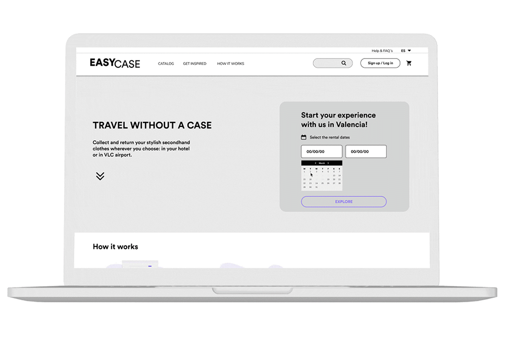
EasyCase sitemap
Having clear the sitemap, the screens are designed based in its requirements that have been defined as necessary to define the service.

Clothing catalog.
The users are used to shopping platforms, to make the service as user friendly as possible, the Easy Case structure have to be similar to the already existing websites.

Clothes.
The clothing items must have detail information, specifying measurements and characteristics, and showing photos of the state of the garment. This will provide trust from the user on the quality of the items.


Start your experience in VLC.
Travel date selection to be able to filter the clothing and therefore show those that are available.
Rent the clothes.
The main service will be renting the different garments. This part shows step by step what you have to do and the different types of payment, pick up and return of the clothes.
Inspiration.
It is difficult to choose different clothes and combine them without having physically seen them. Therefore we propose looks for the users to see combinations of different garments similar to the ones found on the platform.
Wishlist.
Some users who land on the application may be are planning to go on a trip, but may still do not know for sure when or may be just taking a look. This section will help them save the clothes they like the most for when they want to rent.
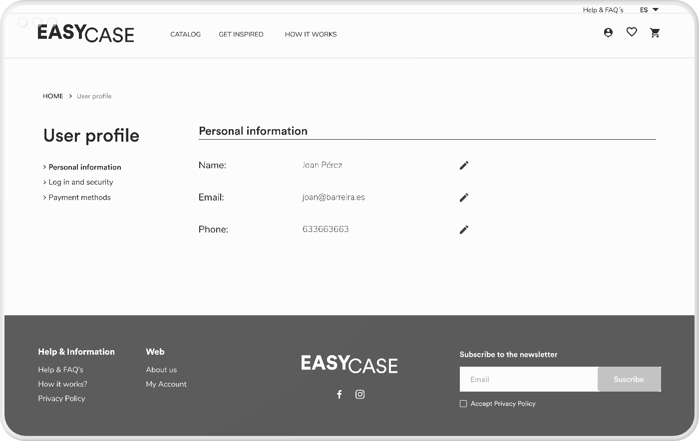

User profile:
It should include three sections: personal information, log and security and payment methods. This information must be editable.
Confirmation email.
At the end of the payment, the user must receive an order confirmation email, where they are briefly informed of: order number, list of clothing, day and place of delivery and the total amount that has been paid.
Wireframes and feedback.

Renting clothes flow
Flow of the steps to rent some clothes.
The user filters the catalog of garments available on the dates that go to Valencia. When you have the catalog with the available garments, you choose the ones you like and they accumulate in the cart until you decide to rent them. In this case, as the user is not logged in, they are asked to do so or to register at the end of the process to avoid any friction.
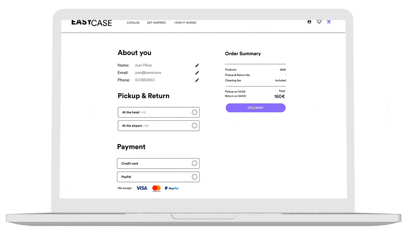
Payment flow
Payment process after having accepted the cart purchase. The user can change his data if he needs it, choose if he prefers to pick up the clothes at the airport or at the hotel, assuming the price difference. You must choose the method of payment and you are informed of the cancellation policy. You are informed of the total to pay and when making the payment the screen shows an order confirmation with the details of your rental.
The user also receives this order confirmation by email.
Flow to get inspired
Feedback.
Once the wireframes were made, the design was evaluated with five users. The design was validated by these five, since they understood the functionality of the platform. Even so, the return process was not clear in any of the cases.
On the other hand, the shipment of the garments was another weak point, since until the end of the process it is not known what the shipping options are or how the clothes will arrive.
Therefore, once the product has been validated, we iterate on these most painful points so that the service is easy to use and meets user expectations.
The second round of interviews validated the changes that were made, even so the users still did not scroll the home page, they already understood more easily how the rented garments were delivered and returned. In addition, we discovered that the home was not understood as the home screen in breadcrumbs.
Finally, we made these last two changes, since the other aspects were already validated.
We focus on our early adopters: young women who travel frequently, and we propose the following solution: travel without a suitcase every time you catch a plane renting good second-hand clothes at destination. Thus aspiring to be the AIRBNB of fashion.
What did I learned?
Good communication.
Two days before the presentation we left the prototype ready. The third partner, without notifying the rest of the group, decided to change the nomenclature of everything without realizing that she was breaking the links. When we made the presentation, the pototype was not working. We learned that you always have to communicate to the team if you are going to make any changes to ensure that it will not affect other aspects of the project.
Prioritize.
At first we wanted to cover the development of all flows. We learned that time must be spent in developing the main MPV flows and validating them as many times as necessary. If you have time you can invest in secondary flows.
Timing.
We underestimate the time users need to get their feedback. When you are developing a product it is very easy to see the flow, but the user does not know anything about it. We thought it would take 20 minutes to do all the flows and finally we needed to do 40 minute iterations. Before calling users, a prototype test must be carried out to communicate the real time we will need.