DIKALU
Dikalu is a renting furniture website.

Challenge
Design a better way for people between 20 and 30 who live in a rental apartment to find furniture for periods and know what to do with them at the end of the contract.
My rol
To design the UI, the design system and make the prototype.
In this project you will find:

The look and feel

Design System

Flows
The look and feel
The moodboard is the first step to set out the look and feel of the new UI —it includes the brand archetype, fonts, colors, and existing images.

Brand archetype
To begin guiding the design, the brand archetype is carried out, where Dikalu is defined as "Dreamer".
Dikalu attributes are: ephemeral, stylish, novel, friendly, ecological, comfortable, accessible and fresh.
The brand has to transmit being: cheap, ecological, feminine, adult, serious, gourmet, international, everyone uses it, colorful, elegant, modern and organic.

Existing images
A style of purist images is sought that evoke the home. Warm colors such as brown or beige typical of wood and linen on a white background are understood as ecological and comfortable, following the attributes of the brand archetype.

Why use these colors?
The colors are chosen by the inspiration of the images and following the attributes of the brand archetype.
The palette must be colorful, adult and that is why blue is chosen. Pastel pink represents femininity. Yellow gives it the attributes of friendly, approachable, everyone uses it. Black gives it an elegant and serious touch.

Why use these fonts?
As the name indicates, Playfair Display is well suited for titling and headlines.
Being a transitional design, stylistically Playfair match with Source Sans pro sans serif font, used for body text.
Playfair Display is a classical typeface with a modern feeling that give designs the accurate elegance and femininity.
Source Sans pro, Adobe's first open source typeface family. It is a sans serif typeface intended to work well in user interfaces, hence, it is clear and easy to read on web and digital displays.
Both typefaces have wide language support for Latin script.
Design System
This are the components used to develop the UI.
It was developed using Figma.


Flows
This are some of the prototype flows of Dikalu.
Buying flow
This flow shows how to buy the furniture that the user have in the cart.
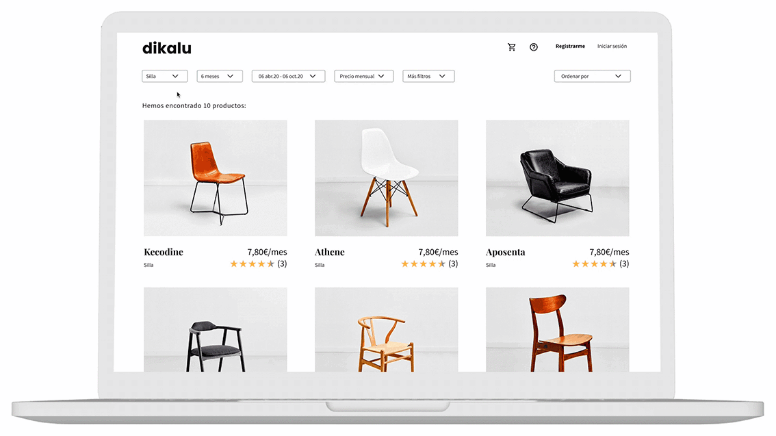
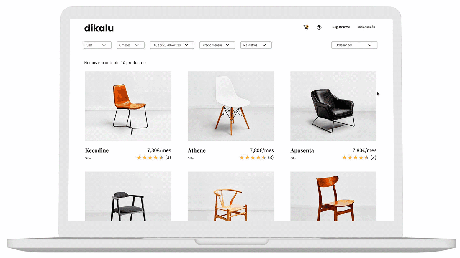
Catalog flow
Here is shown the catalog with its filters.