
Fifty is an application that provides the entrepreneur a platform to sell his services to people who are interested in his products.


Challenge
How to offer an attractive digital solution to help small business that suffers COVID consequences.
My rol
Develop a complete digital solution, research, solution UX and UI, based in a verified data.
The consequences of the COVID with the confinement, closure of premises and distancing has diminished commercial activity and has been devastating for Spanish pypes. Micro-enterprises make up 96% of our business fabric and 70% are not digitized, which foresees, among other factors, a serious economic crisis.
The theme we chose within the post-COVID world is: digital solutions for non-digitized micro-businesses.

Understanding the problem.
Small services business are not selling enough.

Solution: the niche.
A digital solution where the user can sell their services online.

Let’s make an easy UX!
Double and simple interface: for consumers and entrepreneurs.

A friendly and modern UI.
The UI has to convey a kind, friendly and modern experience.

Understanding the problem
This research is the foundation for the design and strategic development of this product. With different processes, the solid evidences that have defined the solution have been obtained.
1 - How can I help the companies?
· 96% of the companies are micro-companies of which 70% are non- digitalized.
· The commercial activity has dismished.
Research documented in Notion, clic here to access.
2 - What can we read in the articles?
· In the micro enterprises in Spain the owners are, mostly, around 49 years old men.
· The online consumption, Direct to Consumer, is increasing.
3 - What claims are shown in the doors of the small shops?
· "Thank you for supporting small businesses"
· "We wait for you by appointment"
4 - What are the others doing?
19 companies have been analyzed.
·In most platforms the small business does not have visibility or advertising, only the product has visibility
5- How COVID has affected the entrepenours?
7 interviews are conducted.
· Due to COVID they have had a strong drop in income but they are resigned.
· What works for them is "word of mouth".
· Many of them have difficulties with digital products
6- How is the consumer behavior?
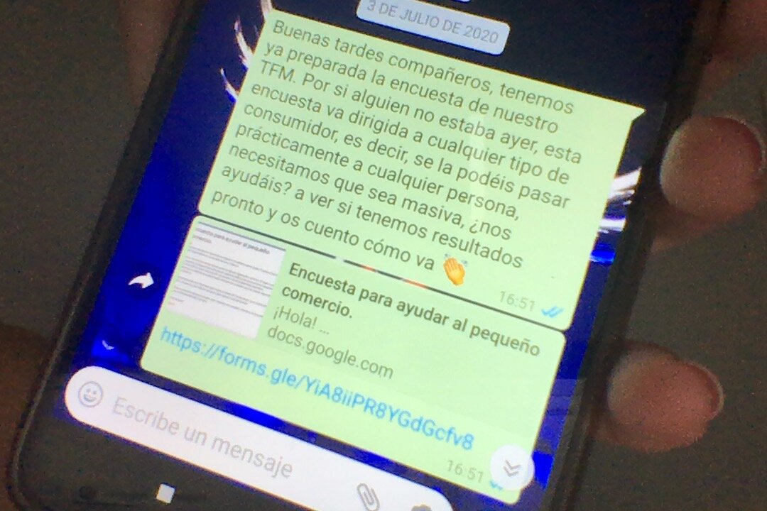
More than 150 surveys have been conducted.
It is learned from this surveys is that the consumer prefers to buy products to big companies and services to small businesses because of the personal attention.
7 - Workshop:
· The user should directly consume an online service.
· The communication between the consumer and the employer must be direct.
· The employer should have a calendar where they can consult their appointments.


Solution: the niche in the market
With the data concluded from the previous research, the following characteristics that define this digital solution are concluded.
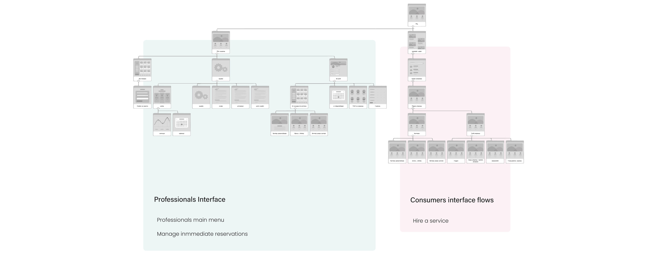
A service sale portal with two interfaces: company and consumer.
The creation of a service purchase application is proposed, where there are two profiles: company and consumer, each with its own interface.
Professionals interface: a sales and service management tool, with its own calendar. When registering, the company profile is defined with its description, services it offers, location and photo.
Consumer interface: a tool to find and buy services in your locality. After the service you can rate and comment on your level of satisfaction in the company profile.
The consumer prefers to buy services in small businesses in their locality because of the proximity they transmit and because they feel that they support small businesses, this is what the UI should transmit.
What is the functionality?
Fifty provides the entrepreneur a channel to communicate and sell his services to people who are interested in his product.
What is the value proposition?
“Communicate with users with maximum exposure and sell online your services by managing your store”
How to monetize?
Fifty makes money with a commission for each service sold.
These are the 3 different services that the entrepreneur can publish on Fifty.

Let’s make it easy experience
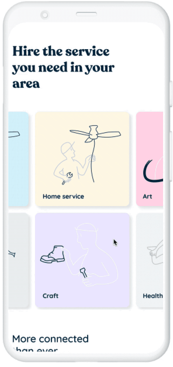
Consumer interface.
Hiring a service
Purchase flow when the consumer is already logged in.
The flow shows a user who needs to change two plugs in his kitchen on October 10 at 9 a.m. In this case, you do not need to enter your address because we have it from when you registered.
We want the shopping experience to be quick so that you can compare at a glance the evaluations and how far away they are from the professionals in your area.
In the end, it is shown a summary ticket and after confirmation, the consumer is informed that if at the end of the service they make the payment through Fifty they will get a 10% discount on their bill.
Professionals interface.
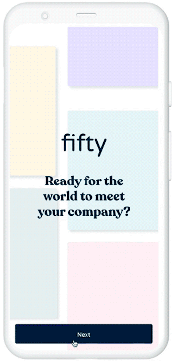
Sign in as a professional.
Knowing that the average age of entrepreneurs is 49 years old, we know that for many it is uncomfortable to use technology and the digital world because it is completely outside their comfort zone.
Under this premise, a frictionless flow has been designed in which we get the user to write the minimum: the name of their company and telephone number.
During the flow, the user selects options and with this, a predetermined description of their business has been designed based on the data obtained.
Professionals interface.
Professionals main menu.
To make the product easy the architecture of the information define three major segments: works, profile, and settings.
In works, the user can check and manage the bookings from clients.
In profile, there are the services catalog, availability, company description, and invoices.
The last segment is settings, where the user can find the privacy policy, help, and Log out.
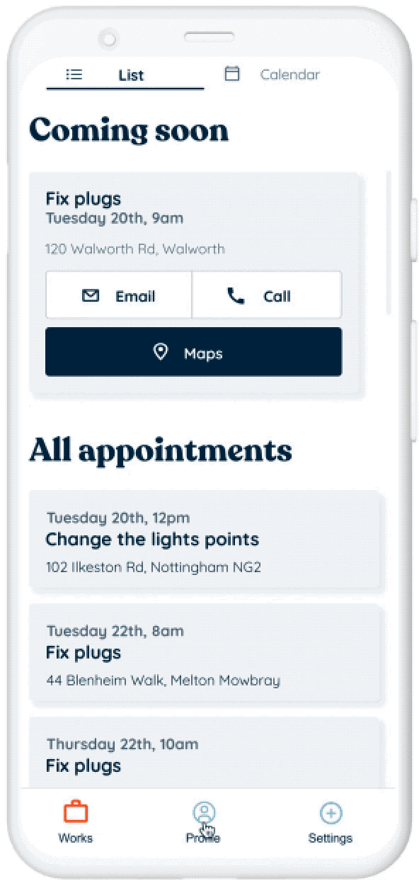
Professionals interface.
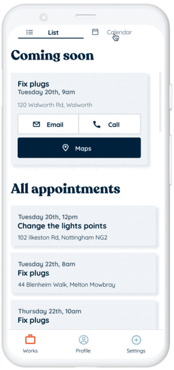
Manage immediate reservations.
As the appointment time approaches, Fifty behaves differently: it sends a reminder notification to the professional one hour before and changes its interface.
Now the card shows a double button to contact the client and an access button to maps to consult the address.
Clicking on email suggests the most common messages that are expected minutes before a service: I am late, once this option is selected a default message appears, cordial for the customer to inform them of the delay.

A kind and friendly UI
Design decisions at Fifty have been made taking into account at all times the users and the knowledge that is had of them after the research.
When the consumer buys in the small shop, he does so motivated by the closeness and kindness that the professional transmits to him, in addition, he likes to feel that he is helping the local trade.
The UI conveys this closeness and friendliness, the color accents are soft and friendly, and carefree illustrations are designed with curved shapes that are found throughout the entire application.
On the other hand, the average age of fifty professionals is 49 years old, many of them are not familiar with digital technologies, considering this, a simple UI is designed, and blue is used as the base color so that it has a formal appearance.
The balanced typographic combination represents the contrast and the generational encounter.
The typeface used is Quicksand, with rounded shapes that, being professional, emits a warm, welcoming, cheerful, and contemporary appearance. Recoleta is used for the headlines, which takes different ingredients from popular fonts from the '70s, recalling a familiar flavor but with a fresh and modern touch.


Conclusions
I am not the user.
In the interviews, I was able to see the mistrust that digital products create in people over 50. I learned to keep in mind throughout the design process that I am not the user person.
Validate before moving on.
I made the mistake of doing a full UX without first validating the conceptual solution. When I iterated with the user person I realized that my idea was not a solution for them, so I had to think of a new solution and of course, make a second UX. You always have to validate a phase before moving on to the next.
Always iterate.
Iterating the UX wireframes I observed that the flows that I thought were going to be easy turned out to be complicated for the user, I changed them to solve these frictions. I learned not to fall in love with my design, the user person is the one who should use it easily.
Be creative to achieve more optimal and fruitful actions.
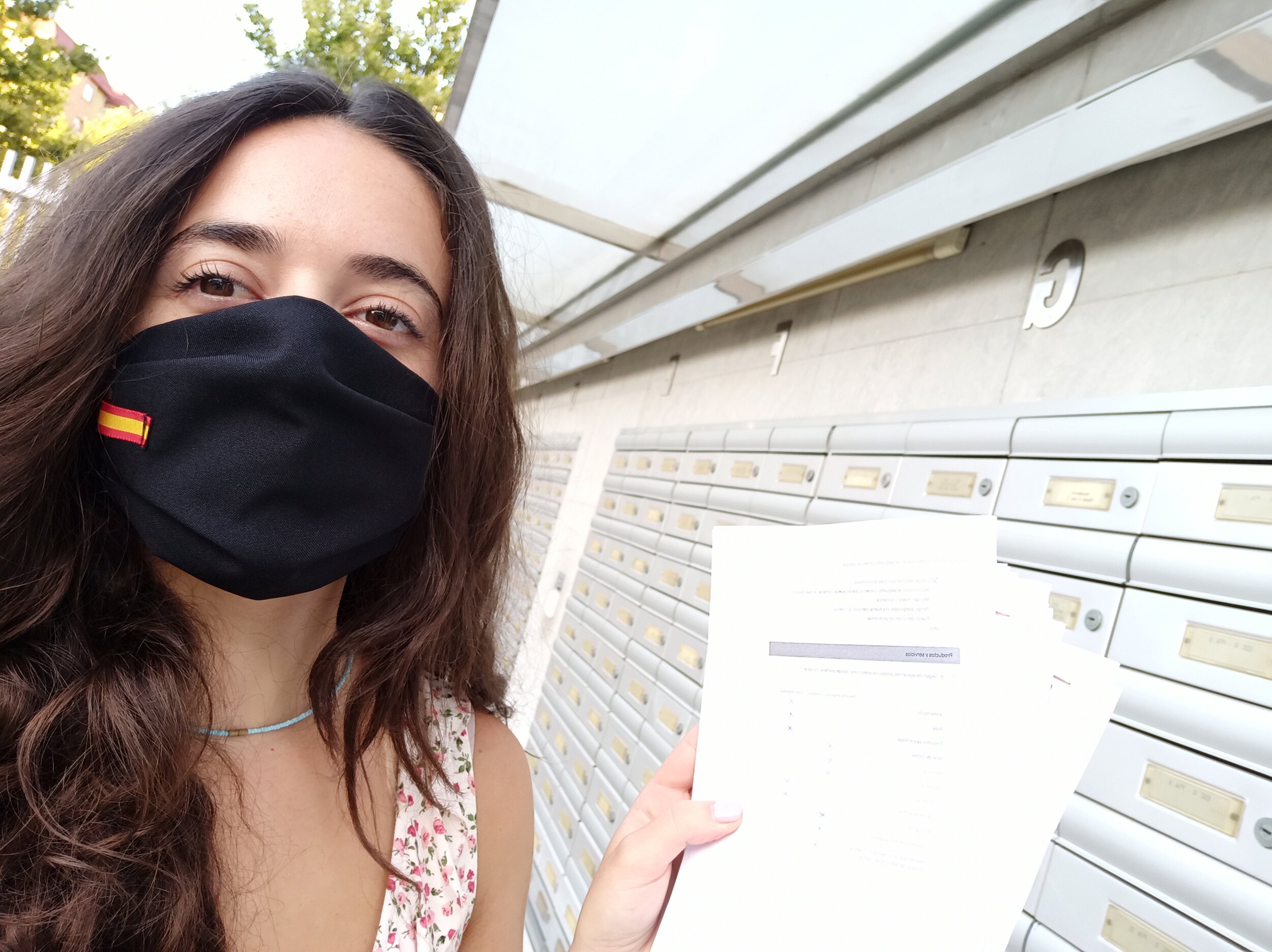
After all the methods carried out to obtain the results of the surveys, I observed that it is more fruitful to distribute many printed surveys at the same time than to personally conduct surveys one by one to each passer-by. Sometimes the most time-consuming and energy-intensive practices do not yield the best results.
To drive workshops to the point.
Online workshops have the advantage of not needing people to move around, but the dynamics are not as agile as when they are done in person, so they require careful thought about the exercises. I learned to design dynamics of online workshops that were to the point.
Keep consistency between elements.
I learned to improve the relationship between elements in the interface to achieve better harmony and better readability.